How to Choose a Font for a Logo: A Step-by-Step Guide for Designers
A logo font speaks before the name is read. Here is a process for choosing one that fits the brand, works at every size and holds up over time.
A logo is read in a fraction of a second, long before anyone consciously reads the name. In that moment the typeface communicates a feeling: serious or playful, premium or friendly, modern or established. A good logo font makes that feeling match the brand. A wrong one quietly contradicts it.
Choosing the typeface is therefore one of the most important decisions in an identity project, and one of the easiest to get wrong, because there are so many fonts and so few honest ways to judge them.
This is a process you can follow, from brief to decision.
Step 1: Define the personality in words
Before you open a single font, write down what the brand should feel like. Not what it does. What it feels like.
Aim for three or four adjectives, and make them specific. "Modern" and "professional" fit every brand and therefore help none. Better:
- "warm, handcrafted, trustworthy" (a bakery)
- "precise, calm, technical" (a fintech product)
- "bold, playful, energetic" (a sports drink)
- "refined, quiet, confident" (an architecture studio)
Add two anti-words, things it must not feel like: "not corporate", "not childish". Anti-words are surprisingly effective for ruling out whole categories.
Step 2: Understand the audience and context
Ask where the logo will live. A logo that appears on a shopfront, a phone screen, a favicon, an embroidered cap and a printed invoice has to survive all of them.
- Will it appear very small? Avoid hairline strokes and delicate details.
- Will it appear very large? Fine details will show, so quality matters.
- Is it one word or several? Long names and short names need different letter shapes.
- Will it be used in one language or several? Check that the typeface supports all required scripts and looks balanced across them.
Step 3: Learn the families, not the names
You do not need to know hundreds of fonts. You need to know what each family of type tends to say.
- Geometric sans serifs feel modern, clean and confident. Useful for technology and contemporary brands.
- Humanist sans serifs feel friendly, warm and approachable. Good for services and community brands.
- Grotesque and neo-grotesque sans serifs feel neutral, serious and established.
- Old-style serifs feel traditional, literary and trustworthy.
- Transitional and modern serifs feel authoritative, editorial and elegant.
- Slab serifs feel sturdy, direct and confident.
- Scripts feel personal, elegant or handmade, but are harder to read and scale.
- Display and decorative fonts feel distinctive, but date quickly and should be used with care.
- Condensed fonts feel compact, urgent and strong.
- Rounded fonts feel soft, friendly and playful.
Your personality words point to one or two of these families. This shrinks the search from thousands of fonts to a manageable area.
Step 4: Preview the real name, not a sample
This is where most logo font choices go wrong. A typeface is not good or bad in general. It is good or bad with these letters.
Type the actual brand name, exactly as it will appear, and look at it across many fonts at the same time. You are checking:
- Letter pairs. Do any combinations in the name look awkward?
- Shape of the first and last letters. These carry the most weight in a logo.
- Overall silhouette. Does the word have an interesting, recognizable shape?
- Case. Lowercase, Title Case and UPPERCASE can feel like three different brands.
- Rhythm. Does it flow, or is it uneven?
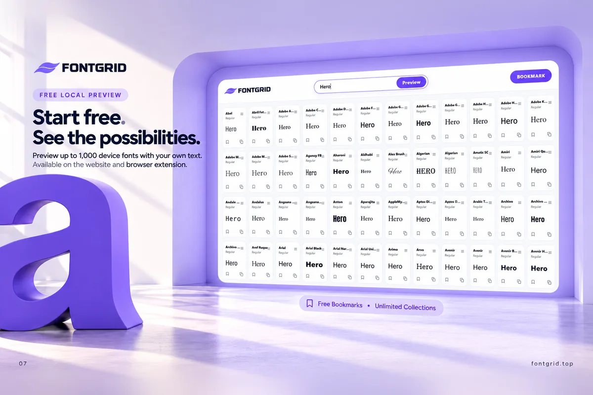
Doing this one font at a time is how designers lose hours. Seeing many fonts side by side, with your own text, lets you spot candidates in minutes. This is exactly what the Smart Grid in FontGrid does, and our guide to previewing fonts with your own text covers the method.
Step 5: Shortlist to three
Scan widely, then cut hard. Keep three fonts that:
- Fit the personality words.
- Look good with the real name.
- Have a distinctive detail you like.
Bookmark them in a collection named after the project so they stay together.
Step 6: Stress-test the finalists
A logo has to work in conditions where it doesn't look its best. Test each finalist against these:
- Small size. Shrink to favicon or app-icon scale. Do the letters stay open and legible?
- One color. Convert to black on white and white on black. Does it hold?
- Large size. Zoom in. Do the letter details still look intentional?
- Variations. Try a stacked version, an initial or a monogram. Does the font work when the name is cut down to a letter?
- Different backgrounds. Photos, patterns, dark and light.
- Both cases. If you may use uppercase for signage, check it.
A font that looks beautiful on a large presentation board and falls apart at 16 pixels is not a logo font.
Step 7: Compare finalists side by side
When two or three remain, place them next to each other with the same name at the same size and judge with a checklist: proportions, spacing, contrast, distinctive details, readability and personality. Our side-by-side comparison checklist walks through each point.
If your logo needs a supporting typeface, for a tagline or secondary lockups, check how the two behave together. See the font pairing guide.
Step 8: Customize to make it ownable
Most strong logos don't use a font straight from the menu. They adjust it:
- Tighten or loosen spacing between specific letters (custom kerning).
- Modify a single letter, such as a terminal, a crossbar or a counter.
- Connect letters with a ligature.
- Change proportions slightly.
- Combine with a symbol so the type and mark work as one.
Even small adjustments make a logo feel designed rather than typed, and make it harder to confuse with another brand using the same font.
Step 9: Check the license
A logo is commercial, permanent and reproduced everywhere. Before you commit:
- Does the license allow commercial use, and specifically logo use?
- Does it allow modification (converting to outlines, customizing letters)?
- Is there a limit on number of users, impressions or products?
- Will the client need to own or buy the license themselves?
Get it in writing and keep a copy with the project files. A preview tool shows how a font looks. It does not grant rights to use it.
Step 10: Present the decision
Show the client a clear story:
- The brand personality you defined.
- Two or three finalists with the actual name.
- The stress tests: small size, one color, dark and light.
- Your recommendation and why.
Export clear previews as images and keep them with the project notes. A decision made with evidence is easier to approve, and easier to defend later.
A quick checklist
- Personality described in 3 or 4 specific words, plus 2 anti-words
- Real name tested in many fonts
- Shortlist of three
- Tested small, large and in one color
- Monogram or short version works
- Customization planned
- License checked for logo use
- Presentation prepared
Common mistakes
- Following trends. A fashionable font can look dated in two years. A logo should last.
- Choosing a font because you like the font. The goal is to fit the brand, not your taste.
- Using too many fonts. One is often enough.
- Judging at one size. Test across the range of real use.
- Skipping the license. An expensive mistake after launch.
- Spending nine hours on it. There's a faster way. That's the reason FontGrid exists.
Key takeaways
- Start with the brand's personality, not with fonts.
- Use type families to narrow the search.
- Always preview the real name, in many fonts at once.
- Shortlist to three, stress-test, compare, customize.
- Check the license before you commit.
Try it with your client's name
Type the name into FontGrid and see how it looks across your fonts. Bookmark your favorites and compare finalists. Start free at fontgrid.top.