How to Compare Fonts Side by Side: A Designer's Checklist
You have narrowed it down to three fonts and they all look good. Here is how to make the final call with confidence, and how to explain it to a client.
There is a moment in almost every typography decision when the easy part is over. You have scanned dozens of fonts and cut the list to three. All three work. None is wrong.
That is the hardest place to be, because the differences that remain are small, and small differences are difficult to judge from memory. If you flip between fonts one after another, your eye adapts and your sense of difference fades.
The solution is to put the finalists next to each other, with the same text at the same size, and ask the same questions of each.
Why side by side beats flipping
Your visual memory is short. When you look at a font and then switch to another, you are comparing what you see now against a fading impression. Fine differences in weight, spacing or proportion disappear.
When fonts sit next to each other, those differences appear at once. One looks slightly heavier. One has tighter spacing. One has a taller x-height that makes the same word feel larger. You do not have to remember anything. You just look.
For this reason, comparison needs three things:
- Identical text in every font.
- Identical size, unless size is exactly what you are testing.
- Everything in view at the same time.
The comparison checklist
Use these questions in order. Write short notes for each font. It takes a few minutes and it makes the final decision defensible.
1. Proportions and x-height
The x-height is the height of lowercase letters such as "x" and "e" relative to capitals. A large x-height makes text look bigger and feel more open at small sizes. A small x-height feels more elegant and formal but can need more size to stay readable. Set both fonts at the same point size: if one looks noticeably larger, that is x-height at work.
2. Width and spacing
Look at how wide the letters are and how much air sits between them. Wide, loosely spaced fonts feel relaxed and modern. Narrow, tight fonts feel compact and efficient. Check the rhythm across the whole word: are there pairs of letters that look too close or too far apart?
3. Stroke contrast and weight
Contrast is the difference between thick and thin parts of a letter. High contrast feels refined and editorial. Low contrast feels neutral and technical. Weight is the overall thickness. Check whether the font at the weight you need still looks balanced, and whether lighter or bolder versions exist if you need them.
4. Letterform details
Look at the characters that give a typeface its identity: the capital "R", the lowercase "g", the "a", the "y", the ampersand. In a logo, a single distinctive character can be the reason you choose one font over another. Check whether you like the details or just the overall impression.
5. Readability
Test at the sizes you will actually use. Look for confusing shapes, such as a capital "I", a lowercase "l" and the number "1" that look alike, or an "O" and a zero that are hard to tell apart. This matters in interfaces, tables and any place where ambiguity is costly.
6. Personality and fit
Return to your brief. Which of the three feels most like the mood you wrote down? A font can be technically excellent and still say the wrong thing about the brand. Ask what the font says before anyone reads the words.
7. Behavior in your real text
Check uppercase, lowercase, numbers and any symbols you will use. A font that wins in lowercase but fails in uppercase may not be your answer if the design is uppercase.
8. Practical constraints
Check the license for your intended use, the language support you need, and whether the family has the weights and styles required. A beautiful font that cannot do the job is not a finalist.
How to decide when it is still close
If two fonts still tie after the checklist, try these tie-breakers:
- Look away and return. Step back for a minute. Which one does your eye go to first?
- Shrink it. Reduce the size or zoom out. Which holds its character?
- Ask what could go wrong. Imagine the font in the hardest use case. Which one survives?
- Choose for the audience, not for yourself. The best font is the one the brand's audience will respond to.
Comparing fonts in FontGrid
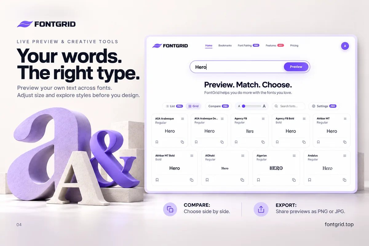
Font Compare in FontGrid is made for this stage. It displays your chosen fonts side by side using the same text, so differences in proportions, letterforms, visual balance and readability are easy to examine. You use the same live text you used while browsing, which means the comparison is about your words, not a sample.
A natural workflow looks like this:
- Use the Smart Grid to scan many fonts with your text and bookmark the ones you like.
- Gather your finalists in a collection.
- Open Font Compare to examine them together.
- Export a PNG or JPG preview of the result.
Font Compare is available in FontGrid's paid plans, and you can try Pro free for 7 days. Smart Grid browsing, live preview, bookmarks, unlimited collections and export are free.
Presenting your choice to a client
A comparison does more than help you decide. It helps you explain.
Instead of saying "I think option B feels more confident," show the client the same name in three fonts, side by side. Point to the details: the spacing, the shape of the capital, the weight. When the client can see the difference, the conversation becomes specific and quick.
Export your comparison as a PNG or JPG, and keep the image with your project notes. It also becomes a record of why the font was chosen, which is helpful when someone asks months later.
Key takeaways
- Fine differences vanish when you flip between fonts. Put them side by side.
- Use identical text and size for every font.
- Judge each font on the same criteria: proportions, spacing, contrast, details, readability, personality, behavior in real text and practical limits.
- Two to four finalists is the sweet spot.
- Save an exported comparison to explain your choice.
Try it
Pick your three finalists and compare them with the text of your project. Open FontGrid and start free.