
Font Pairing Guide: How to Combine Fonts That Work Together
Good pairings feel effortless, but they follow a few clear rules. Here is a method for choosing headings, body text and accents that belong together.
Most good designs use very few fonts. A strong heading, a calm body, maybe a small accent for labels or numbers. The skill is not in finding exciting fonts. It is in choosing fonts that support each other.
Bad pairings are easy to feel and hard to explain: the page seems restless, or flat, or somehow untrustworthy, and no single element is obviously at fault. Good pairings disappear. Nobody notices the fonts, they simply notice the design works.
This guide gives you a method you can repeat.
The one idea behind every good pairing
Pairing works when two fonts have a clear difference in role and a shared underlying logic.
- Different in role means each font has a job. One leads, one supports.
- Shared logic means they feel related: similar proportions, similar warmth, similar era or similar construction.
When fonts are too similar, they look like a mistake: "why are these two almost the same?" When they are too different, they look unrelated, like two strangers in the same room. The sweet spot is a deliberate contrast with a quiet connection.
Start with hierarchy, not fonts
Before you choose anything, decide what text exists on the page and what each piece must do.
- Headline: captures attention, sets the personality.
- Subheading: organizes and guides.
- Body text: needs to be read comfortably for long stretches.
- Accents: labels, buttons, numbers, captions, quotes.
Pairing is a question of how these levels relate. The headline can afford to be expressive because it is large and short. Body text must be calm because it is read in volume.
Five approaches to pairing that work
1. Contrast in structure: serif with sans serif
The classic. A serif heading with a clean sans serif body (or the reverse) gives instant contrast. It works because the shapes are clearly different, while both can share similar proportions and weight. Look for fonts with matching x-height so they sit comfortably together.
2. One family, several weights
The safest pairing is no pairing at all. A well-built family offers light, regular, medium and bold, sometimes with a serif or condensed sibling. Using one family in different weights and sizes produces unity automatically. Use it when you want a calm, systematic look.
3. Expressive display with a quiet text font
Pair a distinctive headline font (script, slab, condensed, decorative) with a neutral, highly readable body font. Let the display font do one job only: headlines. Keep the body font plain. If both are loud, neither works.
4. Shared mood, different construction
Choose two fonts that feel alike in mood (both geometric, both humanist, both editorial) but differ in construction (one with serifs, one without, or one wide, one condensed). The shared mood connects them. The difference separates the roles.
5. Matching a design era or genre
Fonts from the same tradition tend to sit well together: mid-century, modernist, old-style, contemporary geometric. If you can name the shared tradition in a few words, the pairing usually works.
Practical rules that save time
Match x-height. If one font has much taller lowercase letters than the other, they look mismatched at the same size even if they are technically the same point size. Test at equal sizes.
Limit yourself. Two fonts for most projects, three at most. Create variety with weight, size, case and color instead of adding more fonts.
Don't pair near-twins. Two sans serifs that differ slightly look accidental. Either use one or choose clearly different ones.
Give each font a job and keep it. Headings always in the heading font. Labels always in the accent font. Consistency is what makes a system.
Check the weights available. Make sure the family offers the weights you need for hierarchy: regular and bold at the very least.
Test with real content. A heading in lorem ipsum tells you nothing. Use the real headline, a real paragraph, and real numbers.
Consider language support. If the design includes more than one script or special characters, confirm both fonts support them and look balanced together.
A simple method for choosing a pair
- Define the roles. List the text levels in your design and what each should do.
- Choose the lead font first. Usually the headline. This decides the personality. For a logo or identity, see how to choose a font for a logo.
- Pick a supporting font that contrasts in role. If the lead is expressive, the support should be quiet. If the lead is neutral, the support can have character.
- Test them together with real text at real sizes.
- Check hierarchy. Squint at the page. Can you still tell what matters most?
- Try a swap. Replace one font with an alternative and see if the design improves. If you can't tell the difference, you've found a stable pair.
- Compare finalists side by side. See how to compare fonts.
Pairing mistakes to avoid
- Using too many fonts. Variety is created by hierarchy, not by font count.
- Pairing by looks alone. Two beautiful fonts are not necessarily a beautiful pair.
- Ignoring the body font. The body is most of your page. If it is tiring to read, the design fails.
- Making everything expressive. Emphasis only works against calm.
- Forgetting small sizes. Check captions and labels at their actual size.
Pairing in FontGrid
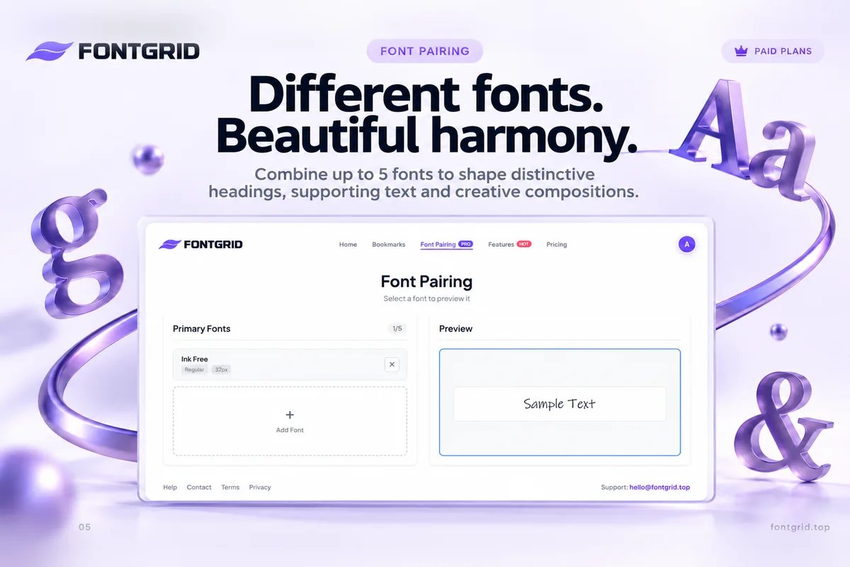
Font Pairing in FontGrid lets you preview up to five fonts together with your own text. That matters because pairing is a relationship, and relationships can't be judged one font at a time. You can see headings, body text and supporting styles in a single view, swap fonts quickly, and judge the whole composition.
A practical workflow:
- Browse the Smart Grid with your headline and bookmark candidates.
- Move candidates into a collection, one for headings and one for body text if it helps.
- Open Font Pairing and test combinations, using up to five fonts.
- Export a PNG or JPG of the winning combination to share with a client or teammate.
Font Pairing is part of FontGrid's paid plans, and you can try Pro free for 7 days. Browsing, live preview, bookmarks, unlimited collections and export are free.
Key takeaways
- Good pairings have a clear difference in role and a quiet shared logic.
- Decide the hierarchy first, then the fonts.
- Two fonts is usually enough. Three is the limit for most projects.
- Avoid near-twins, match x-height, and always test with real content.
- Judge the composition, not the individual fonts.
Try it
Choose a headline, a paragraph and a few fonts, and see how they work together. Open FontGrid and start free.