How to Preview Fonts With Your Own Text (and Why Sample Text Fails)
A font that looks perfect in a specimen can look wrong when it spells your client's name. Here is how to test fonts with the words that matter.
Every font website shows you the same thing: a beautiful specimen. The quick brown fox jumps over the lazy dog. A nice paragraph of Latin. The alphabet in large type.
Then you put your client's name in the same font and it looks different. The letters collide. A capital that looked elegant in the sample looks odd at the start of the word. The font that seemed perfect becomes a candidate you have to argue yourself out of.
This is the most common reason font selection takes so long. You are judging the font by the wrong text.
Why generic samples mislead you
A specimen is designed to flatter the typeface. It uses a pleasing sentence, a comfortable size and the letter combinations the designer is proudest of. Your project uses something else.
Letter pairs change the feel. Every typeface handles combinations differently. A brand called "Willow" and one called "Mixer" will look very different in the same font, because the pairs of letters inside them are different. Spacing, kerning and the way capitals meet lowercase letters are only visible in your actual word.
Length and rhythm matter. A two-word logo behaves differently from a ten-word headline. A font with wide letters may be perfect for a short name and tiring for a long title.
Case changes everything. Many fonts look elegant in lowercase and clumsy in all caps, or the reverse. If your project will be uppercase, test it in uppercase.
Numbers and symbols are part of the design. Prices, dates, ampersands and punctuation often appear in real work. Some fonts have lovely letters and awkward numerals.
Language support is not guaranteed. If your text includes accented letters or a non-Latin script, you need to see them rendered in the font, not assume they exist.
The fix is simple: preview the real text, not a sample.
What to type when you test a font
Do not test with one string. Test with a small set that covers how the font will be used:
- The name or headline itself. This is the main test. Type it exactly as it will appear.
- Uppercase and lowercase versions. See which one the font suits.
- A longer line. A sentence or subtitle, to judge rhythm and readability.
- Numbers and symbols. Try a date, a price or a phone number if they will appear.
- Tricky letters. Names with unusual pairs, tall ascenders, descenders or capital letters that tend to cause trouble.
- Your second language, if the design needs one.
Two minutes spent on this set saves the second-guessing that happens after you have already placed the font in a layout.
The old way: one font at a time
Most designers preview fonts like this: open a font menu, type some text, scroll to the next font, type again or watch the preview update, and repeat. It works, but it has a hidden cost.
You are comparing a font on screen now against fonts you saw two minutes ago, held in memory. By the tenth font you are no longer comparing, you are guessing. And because the process is slow, you stop early and settle for something "good enough".
A better way: see many fonts at once
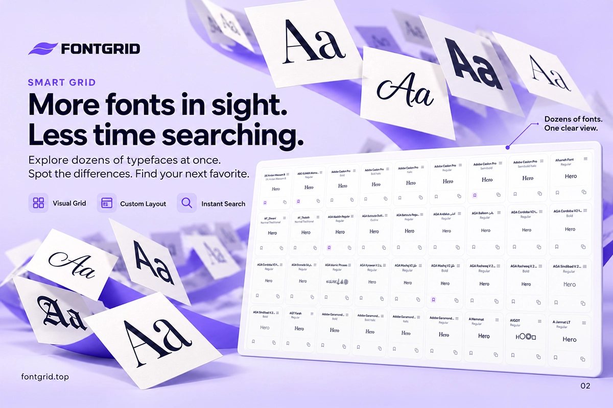
FontGrid is built around a different idea. You type your text once and see it across dozens of fonts in an organized grid, at the same time.
That changes the work in three ways:
- Differences become visible. When fonts sit next to each other with the same words, proportions, weight and character stand out immediately.
- You find candidates you would never have opened. A scan of many fonts surfaces unexpected options, because you are not clicking through names.
- You decide faster. The comparison is visual instead of remembered.
This is what the Smart Grid does. You can adjust how many cards you see to suit your screen and your way of browsing, search instantly when you already have a font in mind, and change the preview size to see your text larger or smaller.
A step-by-step method
Here is a repeatable way to preview fonts with your own text:
Step 1: Start with the brief. Write down three words for the mood you need: for example "precise, warm, confident". This keeps you from collecting fonts that are beautiful but wrong.
Step 2: Type your real text. Put the brand name or headline into the preview field exactly as it will appear.
Step 3: Scan widely. Look across the grid without judging. Bookmark anything that makes you pause. Do not analyze yet.
Step 4: Cut to a shortlist. Return to the bookmarked fonts and remove the ones that fail your mood words. Aim for three to five.
Step 5: Change the text. Test the shortlist with uppercase, a longer line and numbers. Weak candidates fail here.
Step 6: Compare the finalists. Place them side by side at the same size. This is where Font Compare helps. See our guide to comparing fonts side by side.
Step 7: Save and share. Keep the finalists in a collection and export a PNG or JPG preview to show a client or teammate.
Common mistakes to avoid
- Judging by font name. Names say nothing about how a font looks with your word.
- Testing at one size. A font that looks refined large can fall apart small, and the reverse. Check both.
- Looking at only a few fonts. Familiar fonts win by default. Scanning more widens what you consider.
- Skipping the shortlist. Decision fatigue is real. Narrow down before you compare.
- Forgetting the license. Before using a font commercially, check its license. Previewing is not the same as having the right to use it in a logo or product.
What you can preview, and where
FontGrid previews fonts that are available on your device. The free experience lets you preview up to 1,000 fonts with your own text, on the website and in the Chrome extension. Bookmarks, unlimited color-coded collections and PNG or JPG export are free too. Paid plans add Font Compare, Font Pairing with up to five fonts, List View and grid settings, and you can try Pro free for 7 days.
Key takeaways
- Sample text flatters a font. Your real text tests it.
- Test the name, the case, a longer line and the numbers.
- Seeing many fonts at once beats remembering the last few.
- Scan widely, shortlist to three to five, then compare carefully.
Try it now
Type the word you are working on and see it across your fonts in a grid. It is free to start.