
How to Organize Your Fonts: Bookmarks and Color-Coded Collections
Collecting fonts is easy. Finding the right one six months later is not. Here is a simple system that keeps your library useful.
Every designer who has worked for a few years has the same quiet problem. There are thousands of fonts on the computer. Many of them are good. A few are perfect for the thing you are working on now. And you cannot find them.
The collection grew without a system. Fonts were saved when you were excited, not when you were organized. Months later you remember that you liked a typeface "with a sharp R" but not its name, where it came from, or what you intended to use it for.
This guide describes a light system that fixes that, without turning font management into a second job.
Why font libraries fall apart
It usually comes down to three habits.
Saving without context. A font file named after the typeface tells you what it is, not why you saved it. The reason is what you need later: "a warm serif for a restaurant identity", "good for tall condensed headlines".
Organizing by source. Folders like "Downloads", "Free fonts" or the website you got them from are easy to create and useless when you search. You almost never think "I need something from that site". You think "I need something friendly, rounded and bold".
One giant list. When everything lives together, the few fonts you love are buried among the many you only tolerate. Browsing the whole library for every project is how a decision takes nine hours.
Principles of a system that lasts
- Save at the moment of interest. If saving takes effort, you won't do it. The best system is the one you use when you see something you like.
- Organize by use, not source. Group by what the font is for.
- Separate the shortlist from the library. A small, curated set is more valuable than a large, unsorted one.
- Keep it small enough to browse. If a collection has more than a few dozen fonts, it stops being a shortlist.
- Make it visual. Fonts are seen, not read. A list of names is a poor tool for a visual decision.
A four-layer structure you can copy
Layer 1: Bookmarks (everything that caught your eye)
Bookmarking is the quick yes. When a font makes you pause, bookmark it. No analysis, no naming. This is your inbox of inspiration, and it should be easy to add to.
Layer 2: Collections by project or client
Create a collection for each active project: "Cedar Coffee identity", "Studio Nova website", "Wedding invitations". When you start a project, gather candidates here. When the project ends, the winning choices are recorded in one place for future reference.
Layer 3: Collections by mood or style
These are long-term, reusable collections: "Warm serifs", "Geometric sans", "Condensed headlines", "Elegant scripts", "Arabic display". They form your personal taste library, built over time, and they save you the most time because you can start new projects from them instead of from zero.
Layer 4: Collections by role
Some fonts earn their place by doing a job reliably: "Reliable body text", "UI fonts", "Numbers and tables", "Logo-worthy". These are your safe choices when time is short.
You do not need all four layers on day one. Start with project collections and a few mood collections, and add layers when you feel the need.
Using color to find things faster
Visual people find things by color before they find them by name. Assign colors to the kinds of collections you use most:
- One color for active client work.
- One for personal inspiration.
- One for reliable workhorse fonts.
- One for experimental or display fonts.
When you scan your collections, color tells you where to look before you read a word. Keep the scheme simple. Four or five colors you remember are better than twelve you don't.
Naming collections so they stay useful
Good names answer "what will I be looking for?" rather than "what is this?"
- Prefer "Warm serifs for food brands" to "Serif".
- Prefer "Cedar Coffee, round 2" to "Project".
- Add a date or status when it helps: "Finalists", "Rejected, don't reconsider".
Keeping a "Rejected" collection sounds odd, but it saves you from revisiting the same fonts and repeating the same arguments with yourself.
A weekly five-minute habit
A system only works if you maintain it lightly.
- Triage your bookmarks. Move good ones into collections. Remove ones you no longer like.
- Prune. If a collection has become too large, split it or cut it down.
- Record decisions. After a project, make sure the chosen font is noted in the project collection.
Five minutes a week prevents the pile-up that makes libraries unusable.
How FontGrid handles this
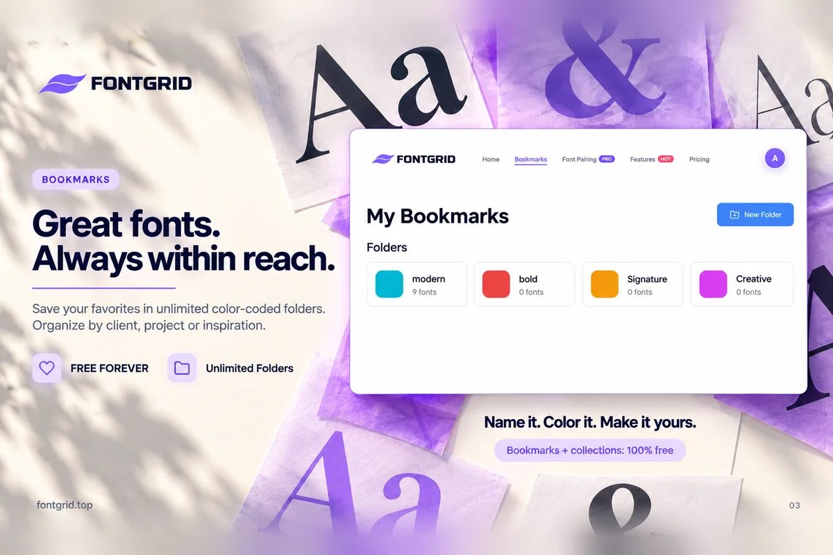
In FontGrid, bookmarks and collections are part of the core experience:
- Bookmark any font while you browse the Smart Grid.
- Create unlimited color-coded collections, free forever.
- See your saved fonts with your own text, so your library is visual, not a list of names.
- Come back without starting over, because your favorites are one click away.
- Use the Chrome extension to preview installed fonts from the browser and keep exploring.
Because collections are visual, your shortlist for a client project shows the client's name in every candidate. Opening a collection is not a reminder of what you saved, it is a ready-made comparison.
When you are ready to decide, move finalists into Font Compare or test combinations with Font Pairing, both available in the paid plans.
Common mistakes
- Creating too many collections too early. Hesitating over where to save defeats the purpose. Start small.
- Never pruning. A collection of 300 fonts is a library, not a shortlist.
- Saving only the font, not the reason. Name collections by purpose.
- Treating organization as a separate task. Save while you work and tidy briefly each week.
Key takeaways
- Organize by use, not by source.
- Use four layers: bookmarks, project collections, mood collections and role collections.
- Color helps you find collections faster than names.
- Keep a small shortlist separate from your large library.
- Five minutes a week keeps the system alive.
Try it
Start your first collection with the next font that makes you pause. Open FontGrid. Bookmarks and collections are free.