How to Find, Compare, and Organize Fonts: A Complete Guide for Designers
Learn how to find, preview, compare and organize fonts. A complete typography guide for designers, with FontGrid tips.
Typography is one of the most important elements of any visual design. The right font can make a brand feel professional, a website easier to read, and a creative project more memorable. However, finding the perfect typeface is not always easy.
Designers often spend hours browsing font websites, opening different font files, testing typography combinations, and trying to remember which fonts they liked.
Whether you are a graphic designer, UI/UX designer, web developer, or branding specialist, having a better font discovery workflow can save time and improve your creative process.
In this guide, you will learn how to find fonts, compare different typefaces, preview font styles, organize your favorite fonts, and choose the right typography for your next project.
Why Choosing the Right Font Matters
Fonts communicate more than words. They create personality, establish visual hierarchy, and influence how people perceive a brand or digital experience.
For example:
- Serif fonts often communicate tradition, elegance, and authority.
- Sans-serif fonts are commonly used for clean, modern, and minimal designs.
- Script fonts can add a personal, handwritten, or elegant feeling.
- Display fonts help create strong visual impact in headlines and creative layouts.
- Monospaced fonts are frequently used in coding environments and technical interfaces.
Choosing the right font depends on your project's purpose, audience, visual identity, and readability requirements.
A beautiful font is not necessarily the best font for every project. The goal is to find a typeface that supports the message you want to communicate.
1. How to Find the Perfect Font for Your Project
Finding a good font starts with understanding what your project needs.
Before browsing thousands of typefaces, consider these questions:
- What feeling should the design communicate?
- Is the project modern, elegant, playful, or professional?
- Will the font be used for headlines, body text, or branding?
- Does the design require high readability?
- Should the typography work across websites, mobile screens, or print materials?
Once you understand the project's direction, you can narrow down your font search.
Explore Multiple Fonts at Once
One of the biggest challenges in font discovery is comparing typefaces individually.
Opening fonts one by one makes it difficult to remember their differences. A visual font grid provides a more efficient way to explore multiple options simultaneously.
Instead of switching between different pages, you can view many typefaces together and quickly identify the styles that match your design direction.
This is especially useful when working on:
- Logo and brand identity projects.
- Website typography.
- Landing page designs.
- Social media graphics.
- Editorial layouts.
- Presentation designs.
2. Why You Should Compare Fonts Before Choosing One
Two fonts may look similar at first, but small differences can completely change the appearance of a design.
Pay attention to:
- Letter shapes and proportions.
- Character spacing.
- Stroke thickness.
- Contrast between thick and thin lines.
- Readability at different sizes.
- Overall visual personality.
Compare Fonts Using the Same Text
An effective way to compare fonts is to preview them using the same words or sentences.
For example, use a headline such as:
"Design Your Next Great Idea"
When the same text appears in different typefaces, it becomes easier to notice differences in letterforms, spacing, weight, and overall appearance.
This method helps designers make more informed typography decisions instead of choosing a font based only on its name or preview image.
3. Preview Fonts Before Using Them
A font preview allows you to understand how a typeface will look in a real design context.
Do not evaluate a font using only the letters "Aa". Test it with different types of content.
Try previewing:
- Large headlines.
- Short descriptions.
- Long paragraphs.
- Numbers and symbols.
- Brand names.
- Navigation labels and interface text.
A font that looks attractive in a large heading might not be suitable for long paragraphs.
For UI/UX and web design, readability is especially important. Always consider how the typeface performs at different screen sizes.
4. How to Organize Your Favorite Fonts
Font discovery does not end when you find a typeface you like.
Designers often discover dozens of interesting fonts while working on different projects. Without a proper organization system, it becomes difficult to find them again.
A font organizer helps you keep your favorite typefaces accessible.
Create Collections for Different Projects
Instead of saving every font in one place, organize your selections into categories.
For example:
- Modern: Clean and contemporary typefaces.
- Bold: Strong fonts for headlines and advertising.
- Elegant: Serif and sophisticated typography.
- Signature: Handwritten and script fonts.
- Creative: Experimental and decorative typefaces.
- Client Projects: Fonts selected for specific brand identities.
Organizing fonts by project, client, or style makes your creative workflow more efficient.
Save Fonts for Future Inspiration
Not every font you discover will be useful immediately.
You might find an interesting typeface today that becomes perfect for a project next month. Saving your favorite fonts allows you to build a personal collection of typography inspiration.
A good font organization system should make it easy to save, categorize, and revisit your selections whenever you need them.
5. How to Choose the Right Font Pairing
Font pairing is the process of combining two or more typefaces in a design.
A good font combination creates visual contrast while maintaining consistency.
Here are some practical tips:
Combine Serif and Sans-Serif Fonts
A classic approach is to use a serif font for headlines and a sans-serif font for body text.
This combination can create a balanced design with a clear visual hierarchy.
Use Contrast Carefully
Fonts should have enough visual difference to create hierarchy, but they should not compete with each other.
Consider combining:
- A bold headline font with a simple body font.
- A decorative display font with a neutral sans-serif.
- An elegant serif with a clean modern typeface.
Limit the Number of Fonts
Using too many different typefaces can make a design look inconsistent.
For many projects, starting with two complementary fonts is a practical approach. You can introduce another typeface only when it serves a clear design purpose.
6. Common Font Selection Mistakes to Avoid
Even experienced designers can make typography mistakes.
Here are some common problems to watch out for:
Choosing a font only because it looks attractive
A font should fit the project's purpose, not just look interesting in isolation.
Ignoring readability
Decorative fonts may work well for short headlines but can be difficult to read in long paragraphs.
Using too many typefaces
Too many fonts can weaken visual consistency and make a design feel disorganized.
Not testing fonts with real content
Always preview your chosen typeface using the actual words, headings, or interface labels you plan to use.
Forgetting to organize saved fonts
Without a reliable organization system, finding previously selected fonts can become a repetitive task.
Ignoring font licensing
Before using a font commercially, always check its license and permitted usage. A font being available online does not automatically mean it is free for commercial projects.
7. Make Font Discovery Easier with FontGrid
Finding, comparing, and organizing fonts does not need to be a time-consuming process.
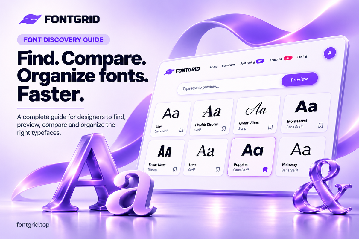
FontGrid is a typography workspace designed to help you explore typefaces, preview font styles, compare options, and keep your favorite fonts organized in one place.
Instead of browsing fonts individually, FontGrid provides tools that support a more visual and organized font discovery workflow.
Explore Fonts with Smart Grid
Browse dozens of typefaces in a visual grid and discover different styles at a glance.
The Smart Grid experience helps you explore multiple fonts together, making it easier to spot differences and find interesting typefaces.
Customize Your Font Viewing Experience
Use custom layouts to organize the way fonts appear on your screen.
A flexible viewing experience can make font discovery more comfortable, especially when comparing multiple typefaces.
Search for Fonts Instantly
Quickly search through available typefaces to narrow down your options and spend less time browsing.
Save Your Favorite Fonts with Bookmarks
Found a font you love? Save it to your personal collection.
FontGrid Bookmarks lets you create unlimited color-coded folders to organize your favorite fonts by client, project, style, or inspiration.
And the best part: Bookmarks and collections are 100% free.
Compare Fonts and Explore Typography Combinations
When selecting typography for a project, comparing different typefaces can help you make better design decisions.
FontGrid also provides font pairing tools for exploring typography combinations.
Whether you are working on a brand identity, website, or creative project, having your font choices organized in one workspace can simplify your workflow.
8. Who Can Benefit from a Font Discovery Tool?
A dedicated font discovery workspace can be useful for different creative professionals.
Graphic Designers
Discover typefaces for posters, advertisements, social media graphics, and visual identities.
UI/UX Designers
Explore fonts for interfaces, dashboards, mobile applications, and websites.
Brand Designers
Compare typography options and build collections for different branding projects.
Web Developers
Explore typefaces before choosing typography for websites and digital products.
Creative Agencies
Keep font inspiration and potential typography choices organized across different projects.
Typography Enthusiasts
Discover new styles, explore letterforms, and build personal font collections.
9. Build a Smarter Typography Workflow
A practical font selection workflow can be divided into five simple steps:
- Define your design direction: Understand the personality and purpose of your project.
- Discover multiple typefaces: Explore different fonts instead of selecting the first attractive option.
- Preview and compare: Test fonts using the same text and compare their visual characteristics.
- Save your favorites: Keep promising typefaces in organized collections.
- Test the final selection: Make sure your chosen fonts work with the actual design content and screen sizes.
Following these steps can reduce unnecessary browsing and make typography decisions more consistent.
Final Thoughts: Spend Less Time Searching and More Time Creating
Typography plays a major role in successful design, but finding the right font should not take more time than the design itself.
By exploring multiple typefaces, comparing their characteristics, previewing real text, and organizing your favorite fonts, you can build a more efficient creative workflow.
Whether you are designing a logo, building a website, creating a user interface, or exploring typography for inspiration, the right tools can make the process easier.
Ready to discover your next favorite font?
Explore FontGrid and start building a smarter typography workflow today.
Visit: https://fontgrid.top
Frequently Asked Questions (FAQ)
How do I find the perfect font for my design?
Start by defining your project's style and purpose. Then explore different typefaces, preview them using real text, and compare their readability, proportions, and visual personality.
What is a font finder?
A font finder is a tool that helps users discover or identify typefaces. Depending on the tool, it may offer search, browsing, preview, or font identification features.
How can I compare two fonts?
Preview both fonts using the same text, size, and design context. Compare their letter shapes, spacing, weight, readability, and overall appearance.
How do I organize my favorite fonts?
Create collections based on project, client, style, or typography category. Saving fonts in clearly named folders makes them easier to find later.
What is the difference between a serif and a sans-serif font?
Serif fonts have small finishing strokes at the ends of certain letterforms, while sans-serif fonts do not. Serif typefaces are often associated with traditional or editorial styles, while sans-serif fonts are commonly used in modern digital interfaces.
Is FontGrid free to use?
FontGrid offers free font discovery features, including font previews, custom text testing, and unlimited bookmarks and collections. Visit the official website to explore the available features and plans.
Why is font pairing important?
Font pairing helps establish visual hierarchy and consistency. Combining complementary typefaces can make designs easier to read and more visually appealing.